Our Brand
A guide on the what and the why
Logo
Our logo consists of two parts: the colored bars, and the wordmark. While there may be some occasions when we use the bars in isolation, the wordmark must always be used together with the bars.
The default and preferred logo uses full color bars with a cloud or midnight wordmark. There are, however, some occasions when this isn’t possible. In these cases, aim for a contrast ration of 2.25:1 to ensure readability.
For instances where the full color logo can’t be used, we offer two monochrome variations of the logo.

More about the Logo
The default and preferred logo uses full color bars with a cloud or midnight wordmark. There are, however, some occasions when this isn’t possible. In these cases, aim for a contrast ration of 2.25:1 to ensure readability. For instances where the full color logo can’t be used, we offer two monochrome variations of the logo.
Color
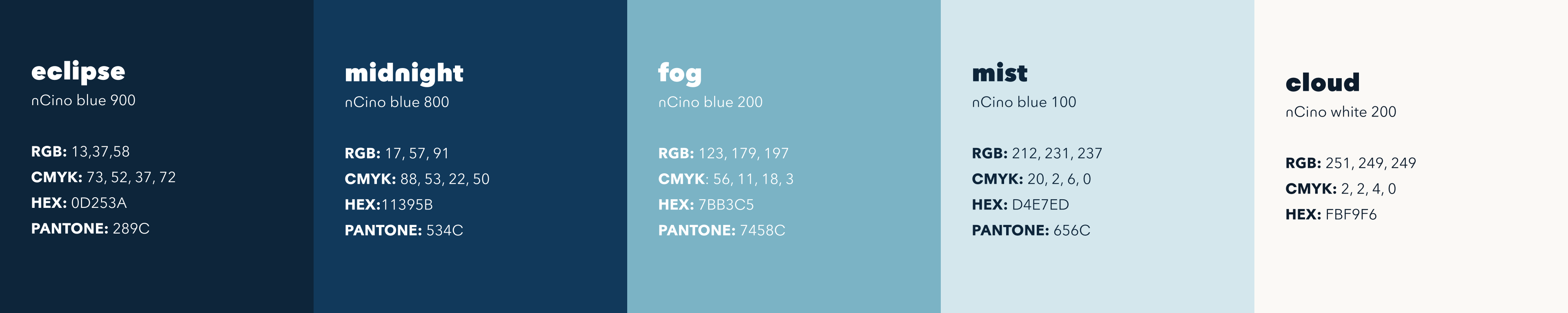
Our color palette consists of two parts: the blues, and the bars.
The blues make up our core brand. They’re the foundation to any design work and should be used on everything.
The bars are where the pizazz comes in. They’re the accent colors and should be used sparingly and with purpose to retain their punch.

Typography
Our primary typeface is nCino + Avenir. This custom typeface was created by Monotype.
nCino + Avenir is a sans serif typeface with a geometric style inspired by the curves of a circle. Much like our brand personality, our typeface is modern, friendly, and clear.
If you need the nCino typeface for your project, please contact nCino's Creative Team at creativeteam@ncino.com

For Press
Additional items such as headshots and boilerplates can be found in our press folder.